Pie Chart

Getting Started
Start with a new Word document.
Go to the LAYOUT toolbar and set page Orientation to "Landscape".

Change your view size to 70-80% using the Zoom slider at the bottom of your window.

- Type out what your chart will be about
- [Enter] to the next line and type your name
- [Enter] so you have an empty line after your name.

Select your page heading. Go to the HOME tab and
- make it a fun/thick font type
- make it bigger (about font size 28 - 36)
- center it on the page

Click anywhere on the line with your name and center it.

Create Chart
Click with your cursor on the empty line.

Then go to the INSERT tab and click the Chart button.

In the window that opens, choose Pie and then choose the 3-D Pie...

Enter Data
You'll get a green window where you can change the data (words and numbers)

First change the column heading text from "Sales" to what you're doing.

- Column A: type out 4 activities in the boxes. Don't worry if not all the text shows. If you can't think of anything, you can do what I did:
-
- reading
- watching TV
- walking my dog
- playing games
- Column B: change the numbers in the 2nd/right column to the same numbers for now (just use whole numbers, not decimals or fractions)

When you're done, you can close the green floating window.

So far your page looks like this...

Format Chart
Click on the chart. Then you should see the new Chart Design tab.

Change Quick Layout to the first/left one. We should then see the data labels and percentages.


Now go to "+" button beside the chart...

- Uncheck Chart Title
- Hover over Data Labels, then click on the triangle and choose Outside End.

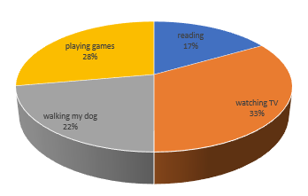
Your chart should now look like this...

Select the chart (click in an empty area) so you get the circles around your chart...

Now hover over the bottom-right circle and drag to the bottom right of your page - you want to make it as big as possible, still keeping the chart on one page, keeping the margin on the right the same as the left).

With the chart still selected, go to Format. Go to Shape Styles > Outline... and set to "No Outline".

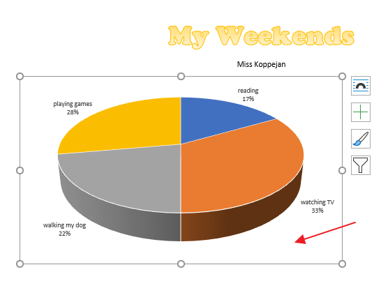
It should now look like this. Click on any of the data labels. Then the other data labels will also become selected.

Go to the HOME tab and change the font type to Bookman Old Style and pump up the font to size 12.


Pictures
Find a picture
In another tab in Chrome, find a picture you want to use for that piece of the pie, right-click on the picture and "Copy Image".

Paste first picture
Click on the chart once, then click on one piece of the chart. You will know it is selected if you see small circles in the center and corners of that piece of the chart.

Then paste in the picture by using the keyboard shortcut CTRL+V.

If the picture you pasted doesn't look good, you can just copy another picture from the internet and paste to replace it (CTRL+V).

Do the same for the next piece of the pie chart:
- Select just the piece of the pie you want to put a picture into.
- In Chrome, find a picture and right-click "Copy Image".
- Then CTRL+V to paste it inside.


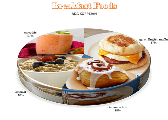
Repeat for each pie piece. When you're done, click to the right of the chart to see how it looks. You should end up with something like this...

change size of chart pieces?
If you don't like how big/small some pieces of your chart are, how much of your picture you see, you can Edit Data - can change the numbers. As you change the numbers, the chart will update/resize each pie piece. Close the window ("x") when you're done.


Move out data labels
Click on your data labels and drag them out a bit away from your chart.


